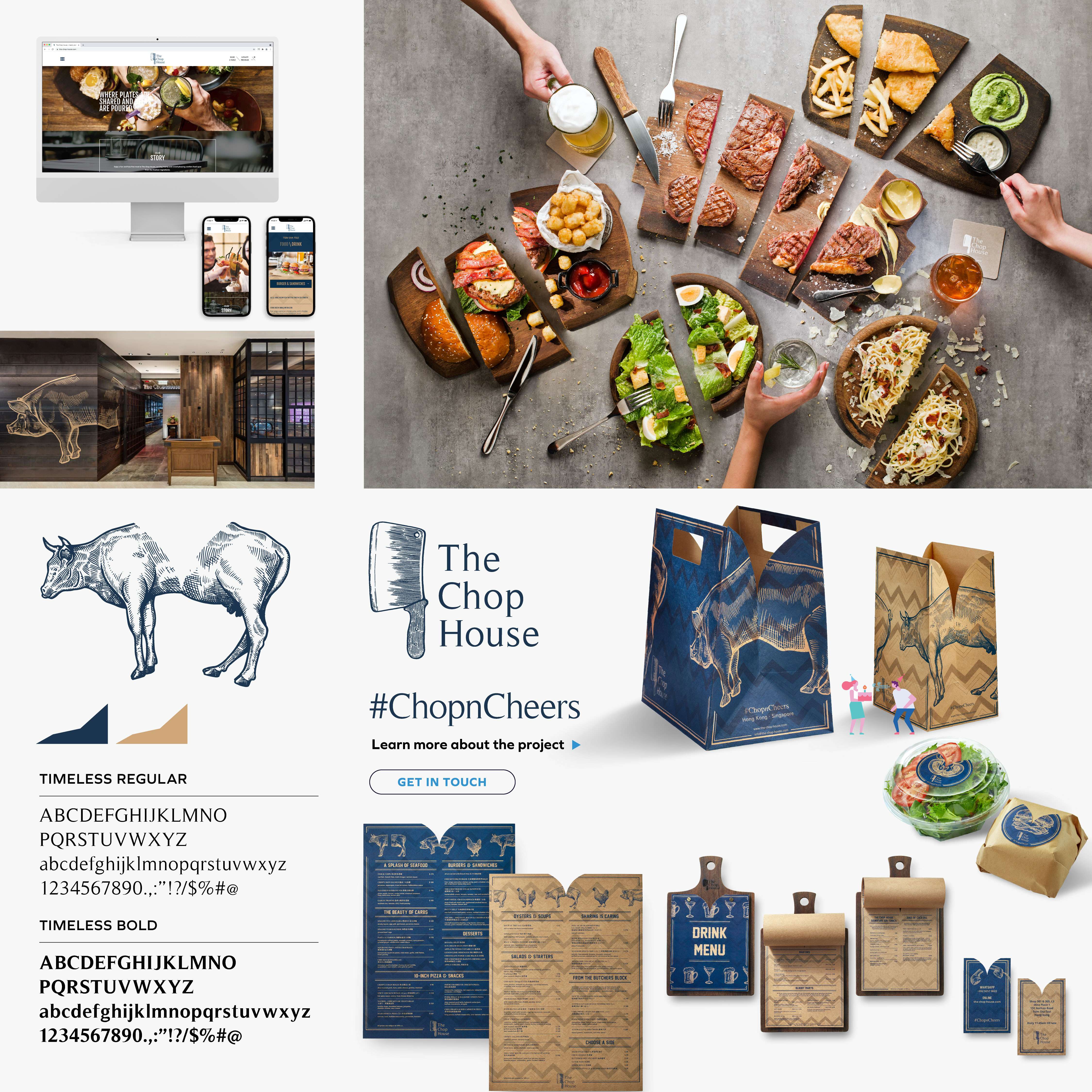
The Chop House
#ChopnCheers
WHY
The Chop House specialises in Australian cuisine and wine, and believes in leisurely eating. The restaurant has an outdoor dining area, where customers can enjoy the sun or evening breeze as they spend time with friends and family. In busy Hong Kong, the Chop House is the ideal getaway from the city’s hustle and bustle.
HOW
The restaurant industry in Hong Kong is extremely competitive. In order to stand out, it’s important to establish an easy-to-remember brand image. We focused on three characteristics of the restaurant: delicious food for sharing, an extensive drink selection, and the outdoor dining area. With sharing and gathering as the selling point, the Chop House is the best choice for happy gatherings in the city.
WHAT
#ChopnCheers encapsulates the theme of the brand identity. Chop is the name of the shop, and it also symbolises food-sharing. Cheers speaks of a joyful atmosphere, and also represents a happy drink.
The visual identity focuses on ‘V’, with different objects split into a ‘V’ to add a sense of humour that matches the ‘cheers’ theme. Every item – from the menu, to the shop card, to the food packaging – is designed with the ‘V’ element. This way, the brand’s theme appears at every touch point, making it easily recognisable and even easier to remember.
#Dining #Branding #UrbaneSimple