via architecture limited
#viaarc
WHY
via. believes architecture can make life better, and design can improve moods. Every project, regardless of its category or size, has the ability to lead people towards a new journey in life – all through the power of architecture and design.
HOW
via.’s creative concept can be summarised into 3 points: passion, respect, delight. This succinctly explains how via. designs a new life journey for customers. The company invests in every project, integrates elements with the environment, and interacts with the team. All of which results in making people happier, inspiring new lifestyles, and creating a new starting point in life.
WHAT
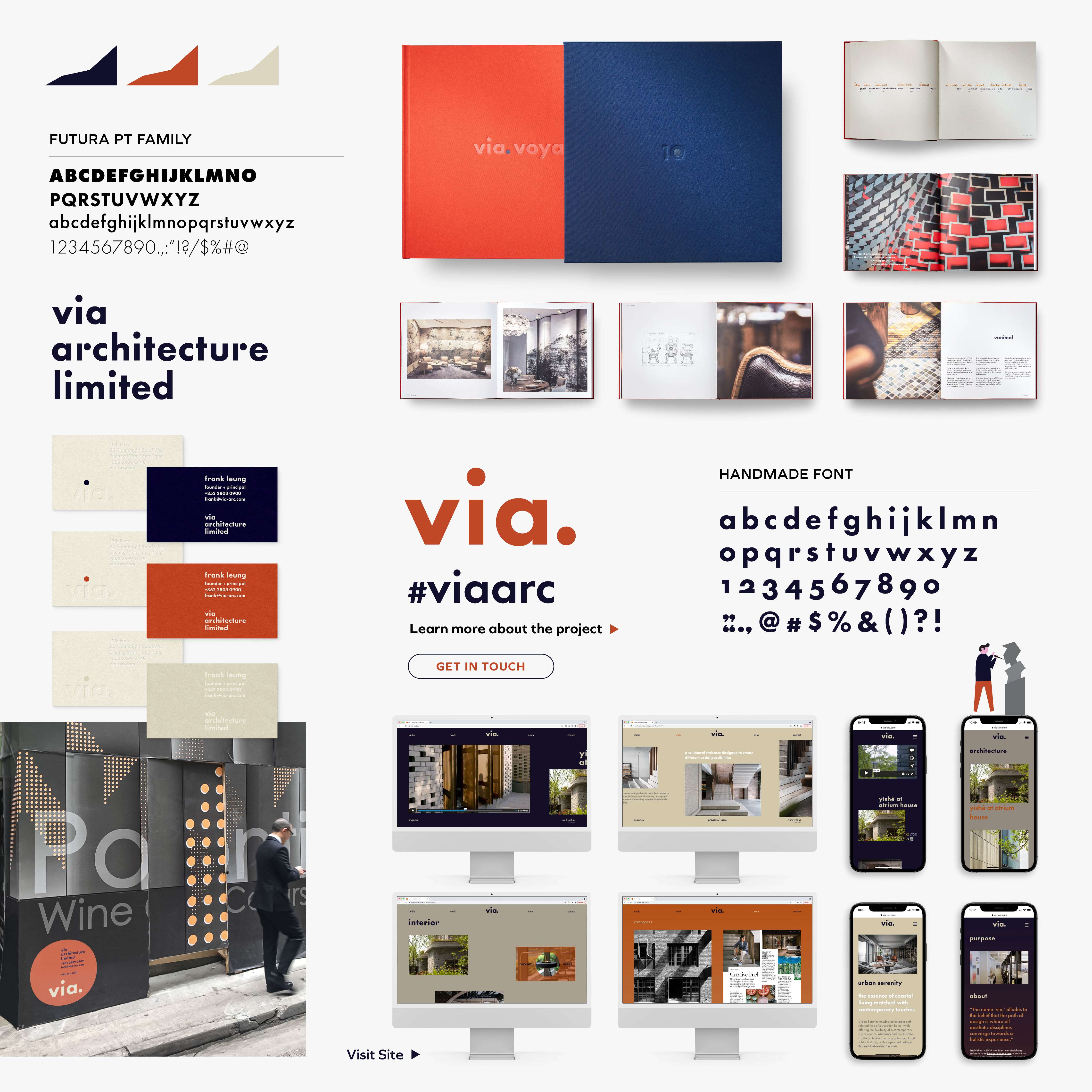
Every single thing starts from a single point. Similarly, brand identity too starts from a single point. We used dots as a key element for typography and various other applications, to express how via. creates a new starting point for its customers through passion, respect and delight.
Colour is also another important element. Beige, dark blue, and mandarin are all symbolic colour representations of the company’s three points.
The two dots of the new logo symbolise the starting point of via.’s creation, and the starting point of the customer’s new life journey. We created a bespoke font that we modified from Futura, and which takes reference from the original Futura in 1927. The result is a set of unique fonts formed using dots, which we evolved for different applications.
#Architect #Branding #UrbaneSimple